
A website can look finished while still being difficult to use with a keyboard, a screen reader, or a small screen. A website accessibility check before launch helps your team find barriers while there is still time to fix them.
This practical review focuses on the paths that matter most to a business: finding a service, understanding an offer, and sending an enquiry. It is a starting point for testing, rather than a claim of accessibility certification.
1. Choose complete customer journeys
Start with three realistic tasks. For example: open a service page from the main menu, compare what is included, and submit a contact form. Include the mobile menu, cookie controls, and any confirmation screen along the way. Testing only the home page misses problems inside the actual journey.
Write down the pages, controls, expected result, and device used for each task. This gives designers and developers a repeatable test instead of a vague request to make the website easier to use.
2. Try the journey using only a keyboard
Put the mouse aside. Use Tab and Shift+Tab to move between controls, Enter to activate links and buttons, and the appropriate keyboard controls for menus and dialogs. You should be able to tell which control has focus at every step.
- Check that menu items and contact buttons can be reached.
- Look for controls that receive focus but are hidden behind banners.
- Confirm that a dialog can be closed and focus returns to a sensible place.
- Record any point where the user becomes trapped or cannot continue.
A visible button is not enough if a keyboard user cannot operate it. Treat a blocked enquiry journey as a launch issue.
3. Review headings, links, and image descriptions
Read headings without the surrounding paragraphs. Do they describe the page in a useful order? Use headings to identify sections, rather than choosing heading levels only for their visual size.
Review repeated links such as “Read more.” Their purpose should be clear in context. For images, decide whether each image communicates information or is decoration. Describe meaningful information concisely; avoid adding promotional keywords that do not help someone understand the image.
4. Make forms understandable before and after submission
Every field should have a clear label. Explain required information and unusual formats before the user needs to guess. A placeholder that disappears while typing should not be the only instruction.
W3C's forms guidance emphasizes labels, instructions, and useful feedback. When something goes wrong, identify the affected field and explain how to correct it. For example, “Enter an email address such as name@example.com” is more helpful than “Invalid input.” After success, show a clear confirmation.
Test empty fields, an incomplete email address, and a successful submission in a controlled test. Check whether previously entered information is retained after an error. Avoid sending repeated test enquiries to the live sales team without arranging that test first.
5. Check zoom and narrow screens
Increase browser zoom and review the same tasks at a narrow width. Watch for overlapping text, clipped labels, and buttons pushed outside the visible area. Important information should remain readable without requiring precise gestures.
Inspect text contrast and controls in their normal, focus, and error states. Do not rely only on color to explain an error or identify a selected option. Use text or another clear indicator as well.
6. Turn findings into an acceptance list
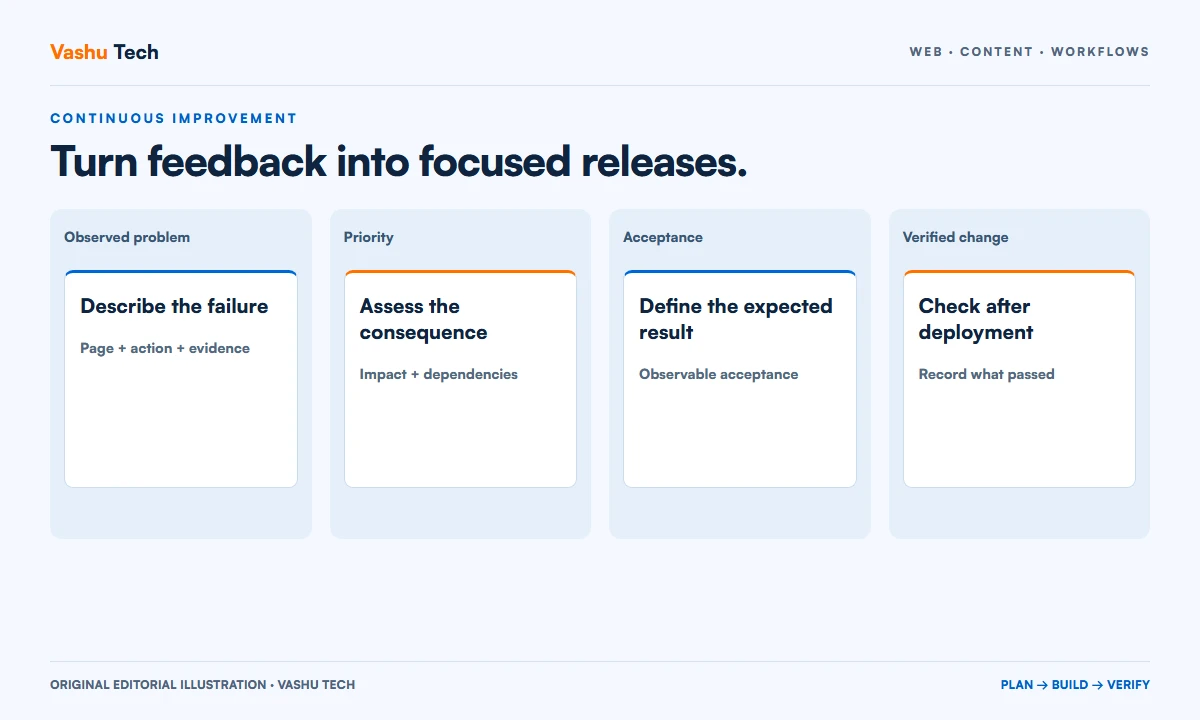
For each issue, record the page, steps to reproduce, expected behavior, and owner. Prioritize blocked tasks first, then confusing instructions and visual problems. Retest the original journey after the fix; checking a code change alone does not show that the journey works.
Automated tools can help find some issues, but manual testing remains necessary. For a formal conformance assessment, define the required standard, scope, and specialist review separately.
Pair this review with our website launch acceptance checklist. If you are planning the wider project, read how to plan a website for a new business.
Need help preparing your website for launch?
Discuss your website requirements with Vashu Tech. Share the pages and customer journeys you want reviewed so the scope and acceptance criteria can be agreed before work begins.
Reference
W3C WAI: Easy Checks — A First Review of Web Accessibility. Also see the W3C forms tutorial for labels and user feedback.