Help buyers compare service scope, deliverables, exclusions and project fit with a clear and maintainable comparison page.
Compare the decisions buyers actually make
A service comparison page is useful when visitors struggle to choose between related options. Identify the difference that changes the recommendation: scope, existing platform, editing needs or operational complexity. Avoid inventing package tiers solely to fill three equal cards.
Ask the sales team which questions recur before a quote. A redesign and a bug repair may both involve an existing website, but they solve different problems. Explain the starting conditions that make each option appropriate so a visitor can recognize their own situation.
Use the same criteria for every option
Choose comparable rows such as intended audience, included outputs, required input and handover. If one option is described by deliverables and another by vague benefits, the reader cannot make a fair comparison. Use plain language and define terms that have a specialized meaning.
Mark exclusions explicitly where they affect the decision. Hosting, content production, subscriptions and ongoing support may be separate. An empty cell should not force the buyer to guess whether something is unavailable, optional or simply undocumented.
Handle pricing without creating false certainty
Display fixed or starting prices only when the business has confirmed the offer and its conditions. If the service requires discovery, explain what affects the estimate and what information the buyer should provide. Do not make a custom project appear fully priced by omitting its important dependencies.
Keep any quoted timeline attached to the scope and assumptions that support it. Content readiness, access and third-party approval can change a project schedule. A comparison page should help prepare a useful enquiry rather than promise a result the delivery team has not agreed.
Make the mobile comparison readable
A large table may become difficult to use on a phone. Choose a layout that preserves labels and relationships at smaller widths, and test it with the longest real content. Readers should be able to identify which option a statement belongs to without memorizing a distant column heading.
Provide an action near each meaningful choice, such as exploring the detailed service or requesting a scoped discussion. If visitors remain unsure, offer a general enquiry route. Avoid making the comparison the only way to reach the underlying service information.
Keep the offer maintainable
Assign an owner to review service availability and commercial details. When an offer changes, update the detailed page, comparison and enquiry options together. Reusing a consistent source of confirmed information can reduce contradictory statements across the site.
Vashu Tech can help design comparison content around an existing service catalogue. Share the offers and the questions buyers ask so the page reflects real choices instead of decorative pricing cards.
Explore Website Design or discuss your project with Vashu Tech.
Start with the reason a buyer cannot choose
Interview the people who answer sales enquiries and collect examples of confusing choices. Buyers may struggle to distinguish a repair from a redesign or a content website from an operational application. The comparison should resolve that specific uncertainty. A table full of technical features is less helpful when the customer does not yet know which problem they need solved.
Write a short recommendation for the starting conditions of each option. Explain what the buyer should bring to the discussion and which question would change the recommendation. This turns the page into decision support instead of a display of arbitrary package names. If the options are not genuinely comparable, use separate explanations rather than forcing them into equal columns.
Define consistent and concrete comparison rows
Choose criteria that matter across the options: intended audience, typical starting point, agreed outputs, required input, exclusions and handover. Keep each row at the same level of detail. A specific deliverable in one column should not be compared with a vague promise in another. Explain specialist terms close to the row where the buyer encounters them.
Use plain values such as included in the agreed scope, assessed during discovery or quoted separately when those statements are true. Avoid a simple check mark where the meaning depends on conditions. A buyer should not have to discover after enquiring that an attractive included feature refers only to a limited configuration.
Distinguish deliverables from outcomes
A responsive layout, an implemented form or a documented handover can be scoped and checked. A guaranteed number of enquiries or a fixed search position cannot be inferred from those deliverables. Explain the intended business use without turning it into an unsupported outcome claim. This keeps the comparison useful while preserving realistic expectations.
If the business has approved evidence of results, describe its context accurately and do not imply that every new customer will receive the same outcome. Keep testimonials and numerical claims separate from hypothetical examples. The comparison should help the buyer understand the work being offered, including the responsibilities that remain with the customer.
Handle conditional pricing transparently
Where a confirmed price exists, present the inclusions and conditions needed to interpret it. If the work is custom, explain the factors that affect an estimate. Existing code quality, integrations, content readiness and verification requirements can materially change scope. Avoid placing an attractive number beside an offer that omits its essential dependencies.
Separate third-party charges and ongoing responsibilities from the initial implementation. State whether hosting, subscriptions, support or content production require another agreement. The page does not need to become a contract, but it should not conceal a cost category that a buyer needs to make a useful comparison.
Worked example: repair, redesign or new application
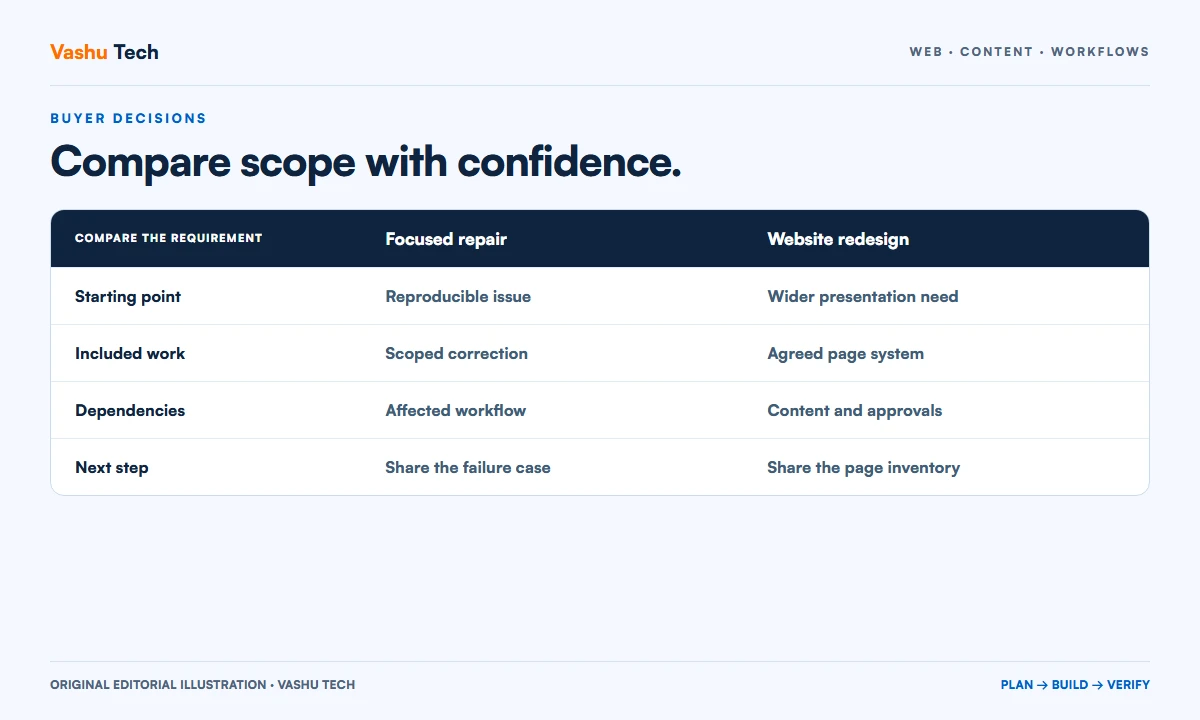
Consider a fictional business with a broken enquiry form and an outdated visual design. A repair option focuses on reproducing and correcting the form problem. A redesign option addresses the wider presentation while preserving agreed functions. A custom application option would only fit if the business also has a specialized operational workflow that a content website does not cover.
The comparison uses the same criteria for all three: starting problem, included investigation, likely deliverables and information needed for estimation. It does not label the largest option best by default. The example illustrates how to separate requirements and is not a claim that these are fixed Vashu Tech packages with predetermined prices.
Keep the comparison usable on smaller screens
Review the longest real content at a phone width. A wide table may need a deliberate scrolling container or a stacked presentation that retains the row labels. The reader should always know which option a statement describes. Avoid reducing text to a tiny size merely to keep all columns visible at once.
Make the relevant next action available without demanding an immediate choice. Some buyers need the detailed service page; others need to describe an uncertain requirement. Provide that route and keep interactive controls keyboard accessible. A comparison works when it makes the next conversation clearer, not when it pressures every visitor into the same package.
Maintain one confirmed version of the offer
Assign responsibility for reviewing the comparison when services or prices change. Check the detailed pages, form selections and any campaign copy at the same time. Contradictory inclusions create avoidable work for the sales team and undermine the purpose of the page.
Keep the source of commercial information clear even when the implementation does not use a centralized catalogue. Before publishing a change, review a representative buyer journey and verify that links still lead to the appropriate scope. Record unresolved offer questions as business decisions instead of allowing the designer to invent a convenient answer.
A practical review checklist
- Identify the actual uncertainty the comparison should resolve.
- Use consistent rows and comparable levels of detail.
- Explain conditions instead of relying on ambiguous check marks.
- Separate verifiable deliverables from unpromised business outcomes.
- Show material dependencies, exclusions and ongoing cost categories.
- Test phone readability and maintain the offer across related pages.
Questions about putting this guide into practice
Do we need three pricing cards?
Only if the business has three meaningful offers that buyers can compare. The number should follow the service model. Two clearly explained scopes or a guided enquiry may work better than inventing a third tier to make the layout symmetrical.
Can a comparison page work without public prices?
Yes. It can explain project fit, deliverables, exclusions and the information needed for an estimate. Be clear that pricing follows the confirmed scope. Avoid showing a nominal price that does not represent the work most buyers will require.
Should the most expensive option be recommended?
A recommendation should follow the buyer's actual requirement and the confirmed offer. A focused repair may be appropriate even when a larger redesign is available. Explain the conditions that make an option suitable instead of relying on a decorative best-value label.
Plan your next step
Discuss a scoped project with Vashu Tech. Share your current website, intended audience and the specific task you want to improve. We can review the starting point, required inputs and acceptance checks before estimating the work.